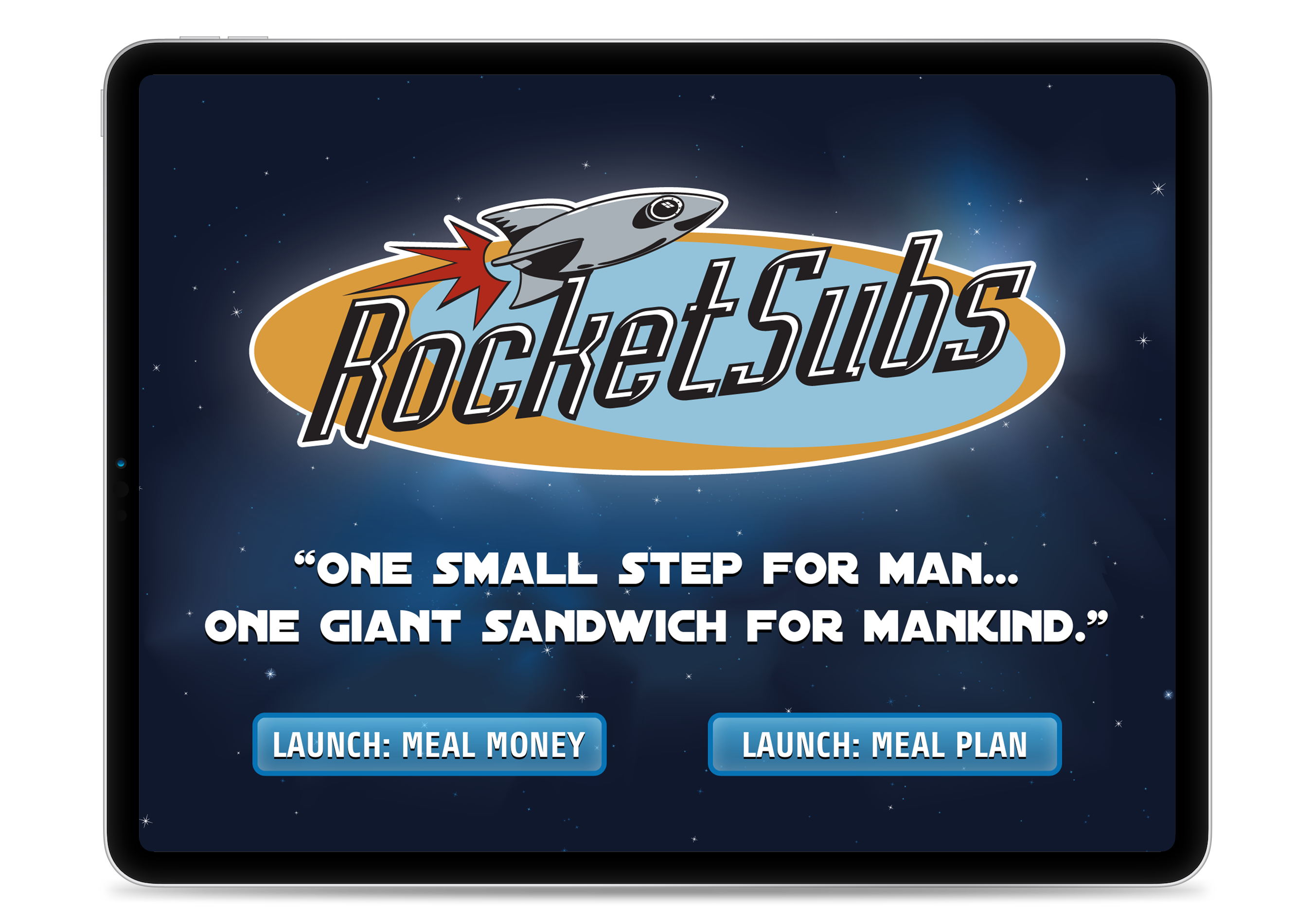
The Home Screen is designed to show your unit’s branding and to give your customers options for varying payment methods.
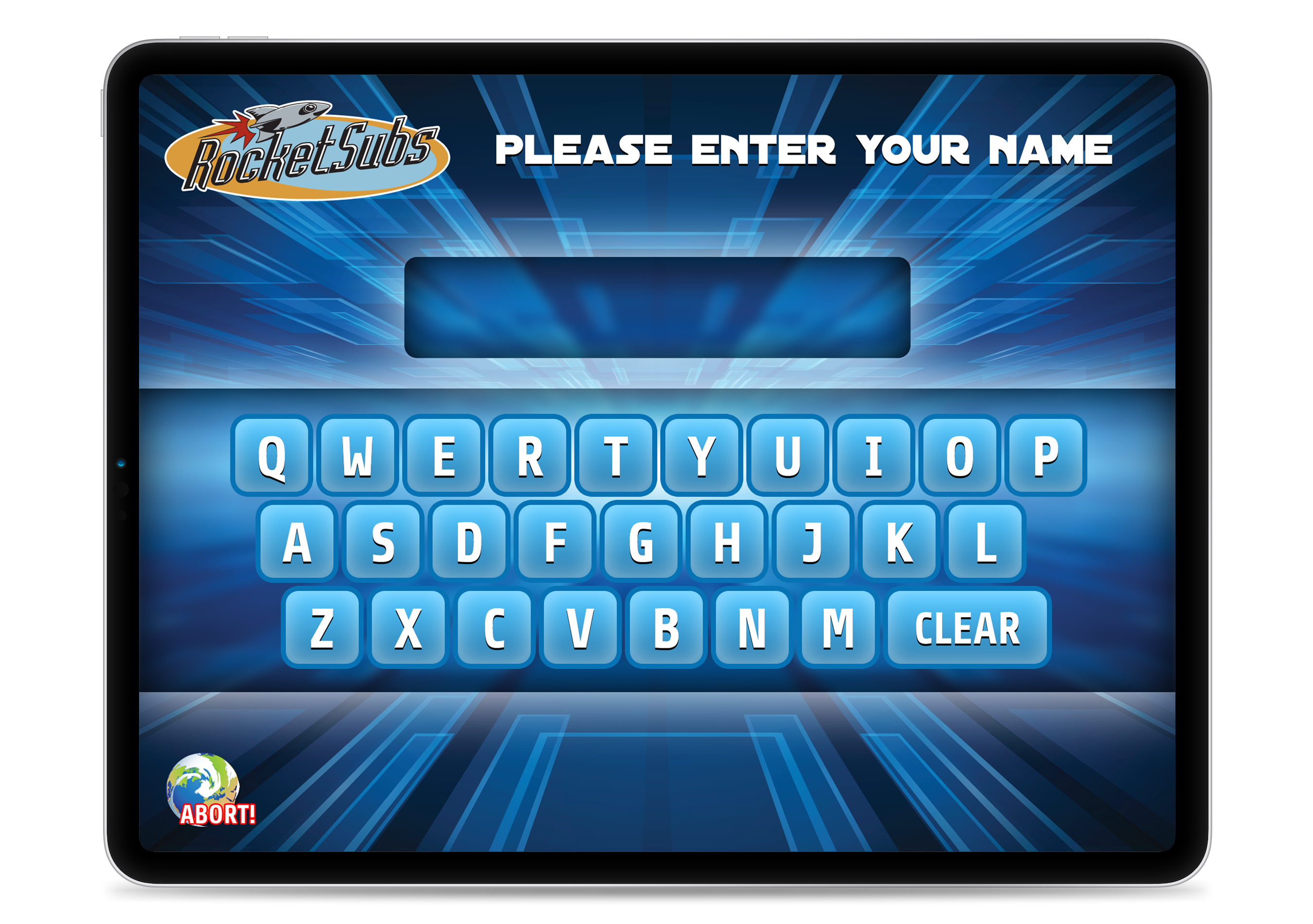
Customers proceed to a screen to enter their name complete with music and sound effects to elicit a better user experience.
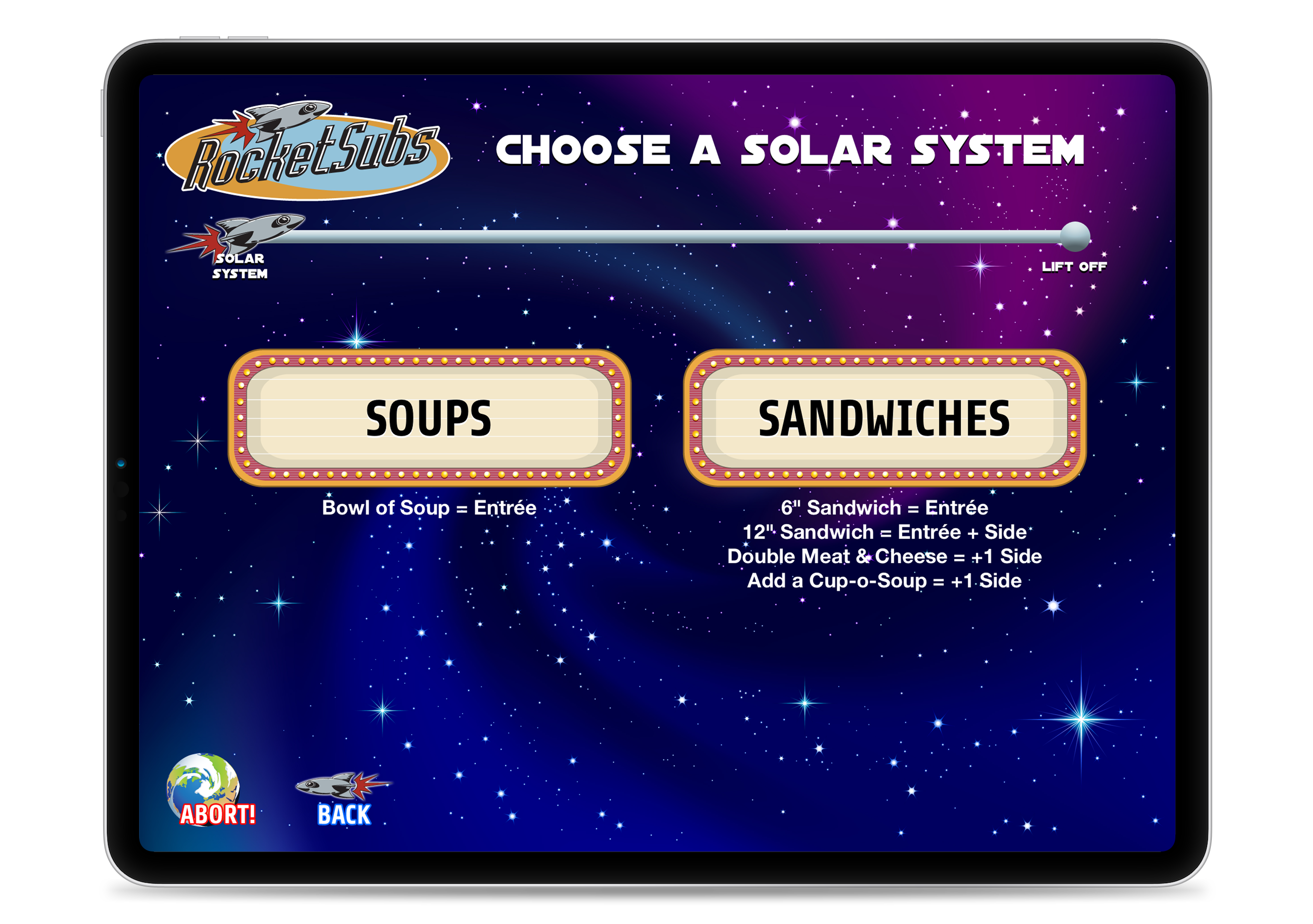
Internally referred to as “flows,” you have the option of offering various categories of foods. In this example, Soups are simple, non-customizable menu items, whereas Sandwiches are heavily customizable, as shown in subsequent screens.
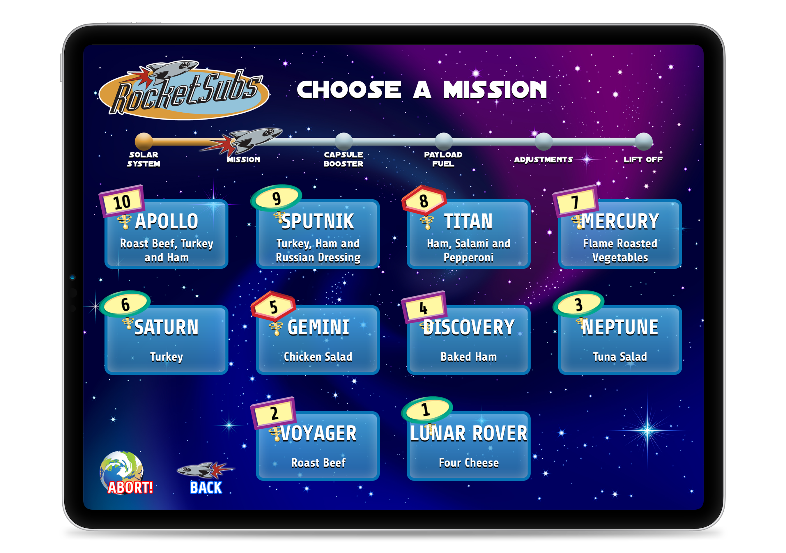
Food options (and their ordering numbers) appear on this next screen. Here, ten menu items are displayed, but the screen can be customized to omit numbering, offer pagination for more than ten, etc. Also notice how the “breadcrumb” at the top of the screen is showing the customer’s ordering progress… with a little outer space flare in this example.
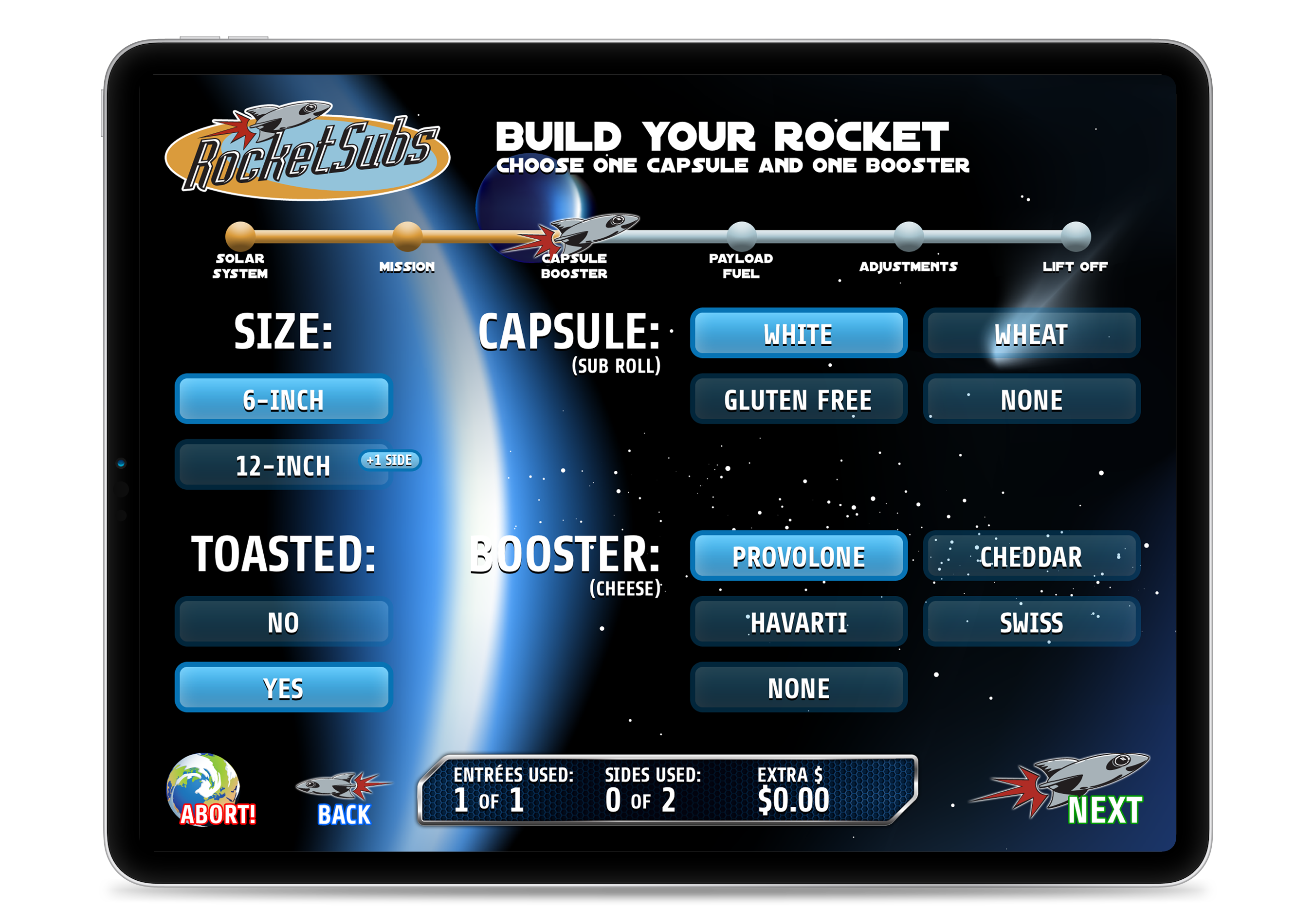
This customization screen allows for a one-and-only-one option. Here, only one type of sandwich bread and only one type of cheese is permitted. At the bottom of the screen, users are given a summary of their meal plan spending. This example allows for an entree and two sides; doubling the sandwich length consumes one side.
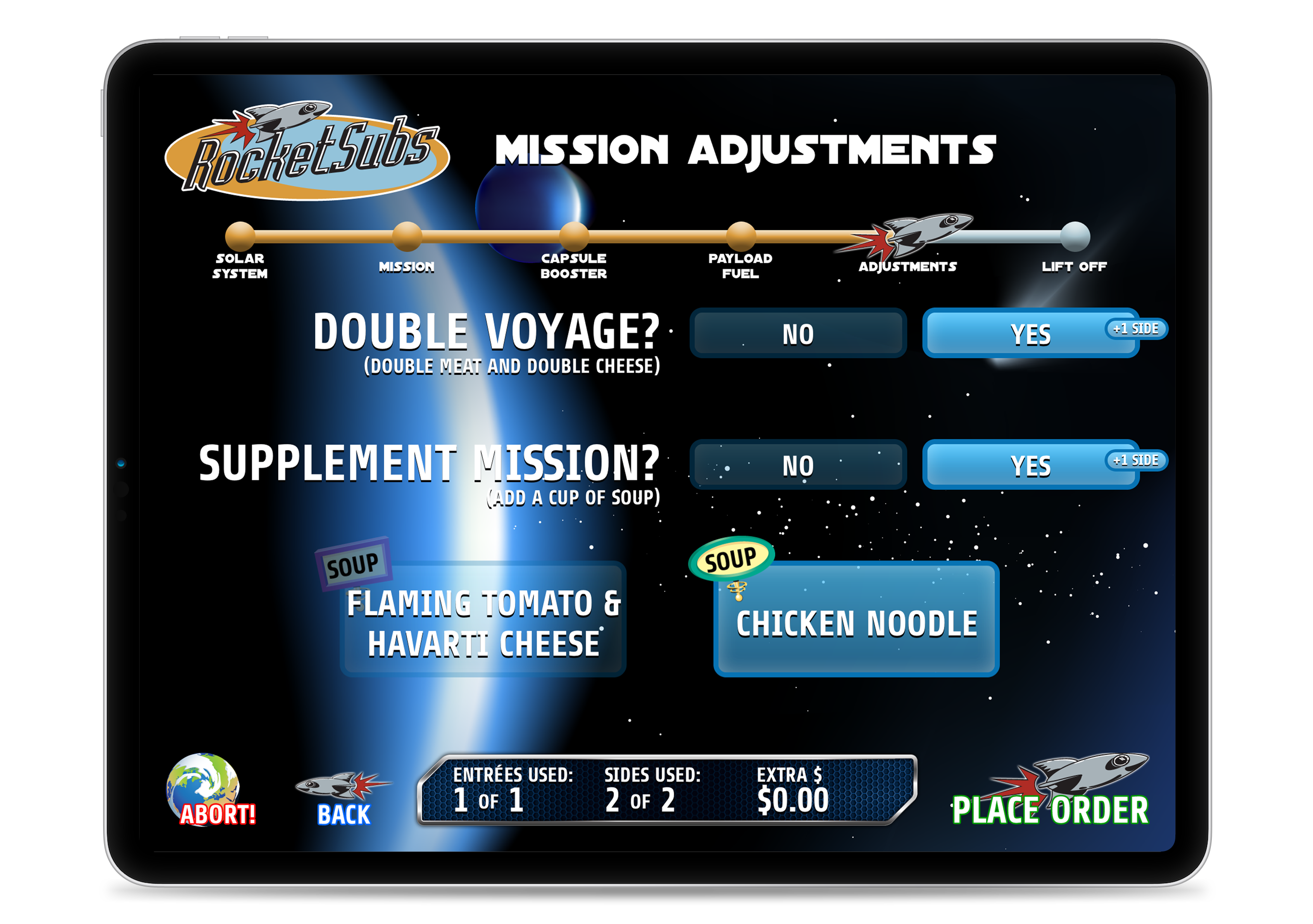
The final step in the ordering process allows for order adjustments by doubling the meat/cheese and/or adding a cup of soup (which was offered as a separate “flow”). If the customer had also doubled the length of the sandwich in a previous step, three sides would be required, but only two would be offered. To accommodate this scenario, using more sides than provided would result in an extra charge in cash or money within the customer’s digital account.
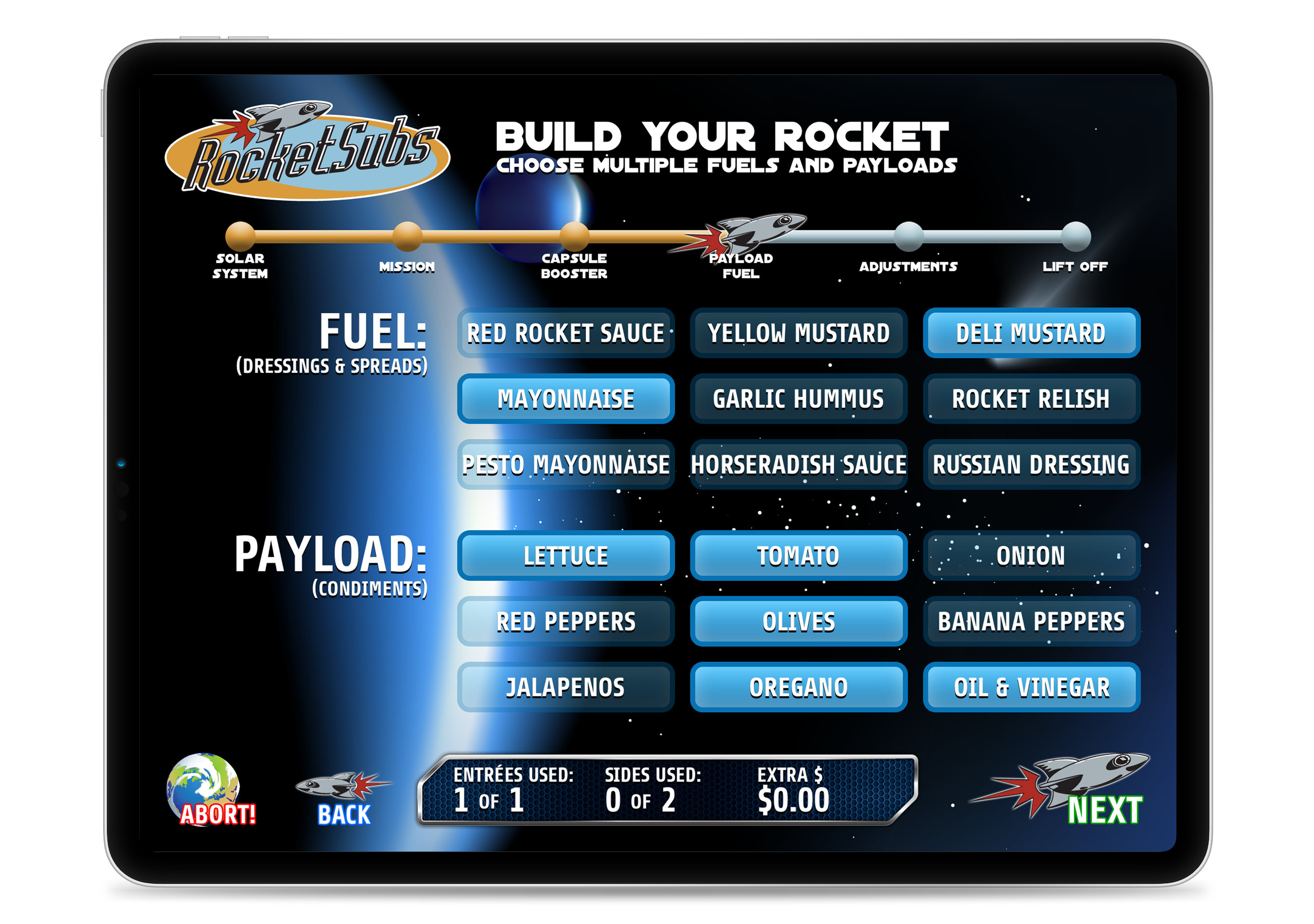
This customization screen allows for an any-of-the-following option. Here, multiple spreads and multiple condiments are permitted.
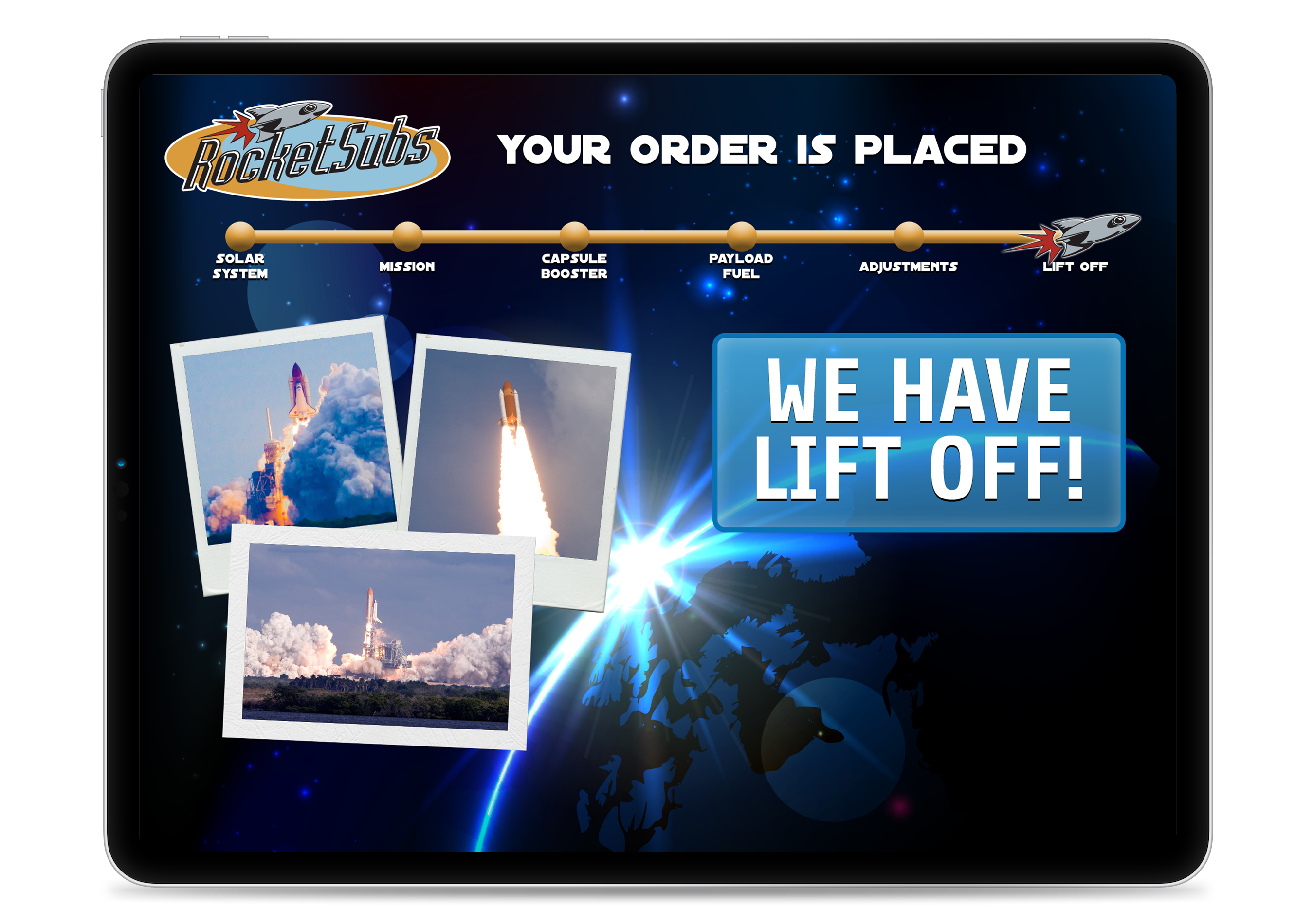
The final screen confirms that the order has been placed. The kitchen will receive a print out through a receipt printer describing the order to prepare along with the customer’s name to be called and the price (either meal plan value or actual dollar amount) that the cashier will need to charge. This step also allows for the app to log the order and report it to the server the next time an Internet connection is available.

The Point of Order App honors a set of hours of operation. When the unit is closed, a “Closed” screen appears preventing customers from placing new orders. The unit automatically reopens at the appropriate time on the appropriate day. And multiple open/closed times can be set for a given day as well.